When the semester began I was scared and nervous about this art class. There were so many uncertainties: I had never used oil paint, I can’t draw to save my life, not to mention my complete lack of creativity. However, the more I created the more confident I felt.
Now, I can say with confidence, I might be an artist after all. Maybe not an artist in the traditional sense, maybe not even a good artist, but I am extremely proud of everything I have created over the last 3 months. I have come a very long way and owe all of that to my instructor, Ann Kim. She pushed my thinking and offered suggestions that never failed to improve my paintings. Most importantly, her own work inspired a passion for art that I thought I had lost years ago.
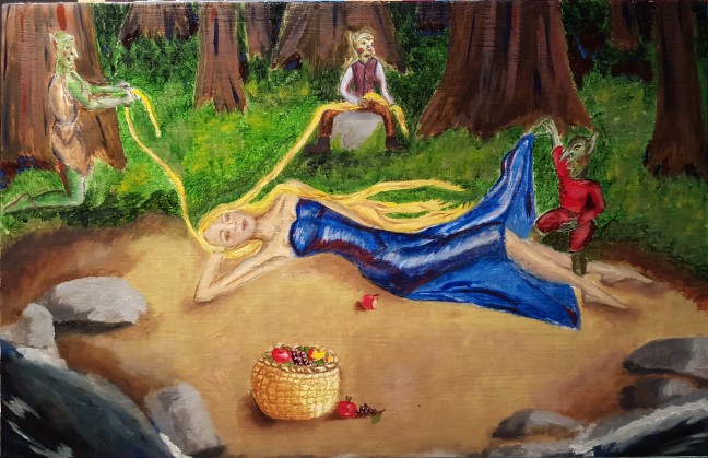
Here is what I submitted for my final project last week:
“The Goblin’s Fruit.” Oil paint.
The content of this painting was inspired by the poem, “The Goblin Market” by Christina Rossetti.
Thank you to everyone that has followed this semester. I look forward to blogging future classes and personal projects!
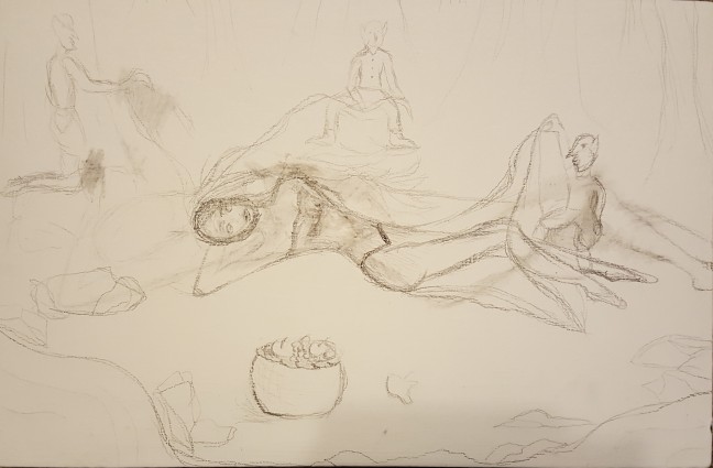
I have barely scratched the surface on my final painting, but if you would like to see my final project check back on Monday, December 14th. It is coming a long fairly well. I completed several sketches. Here is what I decided on:
I’ve never had formal training in regard to drawing, so the sketch is rough, but it’s all getting painted over anyway, so I wasn’t concerned with perfection.
When planning this painting I wanted to pay very close attention to the placement of the goblins and the dynamic shape of the woman’s body. Inspired by Caravaggio, I knew I had to create a compelling use of space. This sketch does not do that very well, but as I get further in the process I can adjust that.
I will also be sure to make a very good use of the lighting in the piece. Caravaggio always used high contrast and harsh shadows in his art; I plan on recreating that aspect of his work.
This project has proven to be far more challenging than any other so far. The creative aspect is difficult and the fear of screwing it all up has crept back up on me. I just keep trudging though. The number one lesson I have learned in this class, is that even with very little talent, time and hard work can produce some impressive paintings.
As we head into the last few weeks of the semester we have finally been assigned our first open project. We can choose whatever content, in what ever color and size we choose.
This is a project I have feared from the start of the class. We are forced into a level of creative thinking that I just don’t have. So I took up a book called “The Art Museum.” This book is an all-inclusive journey through influential art from all over the world. It is beautiful, fascinating, and inspiring.
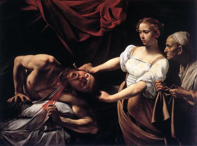
“Judith Beheading Holofernes” By Caravaggio. Licensed under public domain via commons.
I was particularly taken with the baroque artist Michelangelo Merisi da Caravaggio. He was known for his dynamic content and impeccable talent. I was inspired by classic oil paintings during our self-portrait project. Seeing Caravaggio’s startling contrast and depth, I felt that inspiration once more.
In thumbing through the enormous catalog, I noticed many pieces inspired by literature. As an English major, I decided to run with that idea as well. I read the poem “Goblin Market” by Christina Rossetti last semester in a Victorian literature class and it immediately came to mind.
I am setting out to create a composition, inspired by a world famous poet, in the style of a man considered to be the most famous baroque painter in Rome…
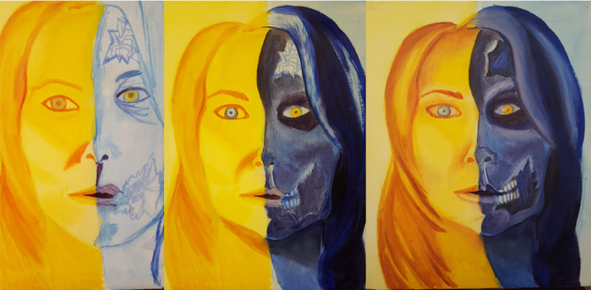
For our next project we set out on a color study using whatever content we chose. We had to utilize an analogous color scheme and a complementary color scheme. Analogous color schemes consist of 3 colors that sit next to one another on the color wheel. Complementary colors are 2 colors that sit opposite of each other on the color wheel.
I chose to do another portrait, not a self-portrait, just a general face. I then decided to split the face in half using two analogous color schemes that are complimentary. I also decided to make the blue side a zombie-there is a metaphor in there somewhere. Here are a few pictures to show the progression:
I felt really good about the zombie side of this painting, but the yellow half seemed to be unremarkable. So my fiance suggested I swap the background colors. The result was impressive.
So, feeling pretty great about what I had on the canvas, I presented it to my professor. Much like the teapot project, she suggested I incorporate the colors into the opposite sides. I had already done this with the iris of each eye, but I was still hesitant to put purple paint on my yellow face. I started incorporating the colors into the hair; I loved the result and got carried away. Here is the final product:
“Complimentary Zombie” Oil on Canvas
This project was really fun for me. I had no idea I could paint a zombie!
Our next and final project is completely up to us. We can choose our own content and color. My professor would like the painting to say something about who we are as artists. I have decided to do something inspired by literature, though I haven’t nailed anything down yet.
Friday (10/23) we critiqued our self-portraits. The final stretch of this project was incredibly tough for me. The last adjustments were tedious and time consuming.
I left you with this in my last post on this project.
“Self-Portrait” Oil and Galkyd
The lines are nice and the color is okay, but it is cold and there is no contrast between the shadows and the highlights.
This project focused on glazing. Which is a long process of layering paint mixed heavily with medium; I used Galkyd. The medium thins the paint and makes it more translucent. With many layers of this translucent paint you will develop a lovely depth to your painting.
This project was extremely time consuming and tested my patience greatly.
After countless layers of paint and galkyd, here is the finished product.
“Self-Portrait” Oil and Galkyd
As I got to work on this piece it reminded me of the old portrait necklaces, called cameos. These pendants were typically carved and set in a colored resin, so as my tribute to that style I finished my portrait with the shiny, resin based medium.
During my critique, the class was split on whether or not they liked this finish, but I was really happy with the result. A tip for beginners: Let galkyd dry flat, it will run and your painting will look like it is melting if you leave it on the easel.
I learned so much over the course of this project, I would like to do it over again.
This project has given me even more confidence in my capabilities. I even picked up a Fine-Arts minor in addition to my English degree.
Our next project is a study of color schemes. Our content can be anything we choose. Spoiler: I chose Zombies.
I lied last week, I thought I would have my portrait done, but I haven’t quite finished it. Our critique takes place on Friday (10/23) so a review of how that went and my finished piece will be posted then.
This week I would like to discuss my favorite artist, and how much more I appreciate her since I have begun this oil paint journey.
My obsession with Georgia O’Keeffe began when I was in second grade. I was tasked with recreating one of her pieces in chalk. As an 8-year-old little girl, and I had no idea who Georgia O’Keeffe was. I flipped through a book loaned to me by my art teacher, and I fell in love immediately.
In 2010, I was lucky enough to visit the Georgia O’Keeffe Museum in Santa Fe, NM. Excitement, is too humble a word for what I felt, standing there in front of her work. I lost it, all of my cool was gone. I cornered a guard and made him tell me everything he knewabout the work. The very obliging man took me on a private tour detailing everything he knew. I learned that he had worked in the museum since its opening in 1997. His passion for her work mimicked mine.
The trip to Santa Fe, yielded many interesting facts about Ms. O’Keeffe’s personal life, like her kinship with the late Andy Warhol, whom I also admire. I also learned of her extremely reclusive demeanor. She spent much of her time, tucked away on Ghost Ranch in Taos, NM.
You can imagine my excitement when I learned of the Georgia O’Keeffe show at the Indianapolis Art Museum last winter; I immediately bought tickets. While the number of works featured in this show couldn’t compare to the number in her museum, the quality of work was overwhelming.
Entering this show in 2015, I had a better eye for art. I was more interested in her technique. I wouldn’t say it was less exciting to see her paintings for the second time, but because it was the second time, I was able to really appreciate her effort and the actual art behind this woman I idolize.
“Jimson Weed” Georgia O’Keeffe. Oil on Linen, 180 cm x 212 cm.
I stood in front of Jimson Weed for a long time, I had never seen it in person, but I had always admired it. Her subtle use of purple within the white of the petals, literally made my heart beat faster (I told you, I freak out.) Standing in front of her colossal 6′ x 7′ painting was breathtaking, but standing next to it was even more impressive. Georgia O’Keeffe not only painted with color but also with texture. When I stood next to the work and looked across it, the beautiful white flowers appeared as shimmering, iridescent shadows. It was as if I was looking at a negative of the flowers, a beautiful, glimmering negative of the painting. This is what separates street art from masterpiece.
I think about Georgia O’Keeffe every time I pick up my paint brushes. I think about all that went into her work. I think about her sheer talent and her ability to change my emotional state just by looking at her art. They say good art hits you in the head, the stomach, or the heart; Georgia O’Keeffe hits me in the heart every time.
Since completing all four still-life paintings, I have been stressed and overwhelmed. Just as I was gaining some confidence, my professor assigned a self-portrait. The basis of the assignment is to create a portrait with layers of transparent color by adding medium to the paint. I used galkyd, a resin-based medium that thins the paint to create a glossy, transparent substance.
Phase 1: The Sketch.
The sketch alone took a tremendous amount of time. The experience of drawing your own face is weird and uncomfortable. I either felt like my sketch was too pretty, too ugly, or looked nothing like me. Several failed attempts looked exactly like a barbie doll and others were unrecognizable.
Original Photo“Self-Portrait Sketch” Pencil, 8″ x 11.5″
Phase 2: The Underpainting.
An underpainting is exactly what it sounds like: a painting underneath the final product. Underpaintings are the foundation of a finished piece. While they are not necessary, they add depth to a piece through contrast and layers. In this particular project, the underpainting works to bring out the shadows and give a rounded look to the face.
“Self-Portrait Underpainting” Oil.
It was helpful to have sketched and studied my photo for so long before starting the underpainting, because it took a lot of work. As you can see there are still a lot of problems with this.
Forehead is too large
Face is too wide
Lips are completely wrong
There are plenty of other mistakes but those are the worst of them.
However, This is a solid foundation and I was happy to start glazing.
Phase 3: Glazing.
I completely screwed this part up. The idea is to apply thin layers of transparent glaze to create depth. I put on a think layer of opaque paint with a little bit of galkyd and destroyed the integrity of my underpainting. But, I am working with it. Here is what I have after 4 layers of glaze.
“Self-Portrait” Oil and Galkyd.
This is not finished. It still needs a lot of work, but I am moving in the right direction. After applying the most recent layer of glaze, I lost a lot of definition in my nose and shadowing around my face, but I am confident I can get it back.
The final stretch of this project has been intense. We set out to create 4 of the same still-life using different color palettes. My last post covered the second painting in the series and I left with what was coming up.
Since then I have completed two others. The first was a study in cool primary colors, white, and NO black:
“Still-Life #3″ Oil Paint. 9″ x 12”
This piece was exciting to paint. Adjusting to the lack of black on the palette was difficult. Learning to darken with a mix of blue and purple gave the painting a lot of depth.
After completing this painting, I was able to chose my own palette. Many of the students in class chose to paint realistically, I did not.
“Still-Life #4″ Oil Paint. 9″ x 12”
I chose teal, purple, and orange. Look how fun this is! I absolutely love how this painting turned out!
This project was challenging, time consuming, and above all, extremely worthwhile. I have learned so many useful techniques, tricks, and shortcuts.
Top 3 Tips and Tricks for Beginning Oil Painters
1. Be Brave. It is easy to stay in your little box and paint safely; it is exciting and brilliant to destroy your box and paint it black and yellow. I could have saved myself a lot of time if I had just had the courage to paint. I was so scared of dark colors and strong contrast; I had to go over all 4 of my pieces several times. By the 4th painting I was more comfortable, but I have room to grow.
2. Colors are cooland warm. Know the difference between cool and warm tones. If you have warm primaries, cool primaries, black, and white, you have all you could ever need. But, you have to know what you can mix and how it will mix. The possibilities are endless, spend a day mixing all the colors you can come up with and see how they play with each other.
3. Pick a Pallete. Your color palette will make or break your work. You can paint the subject immaculately, but poor color choice will destroy your work. I suggest picking the colors you want to work with, play with them, and stick to those colors. Don’t carelessly slap on all the pretty colors you mix and hope they form a cohesive piece (spoiler: they won’t.)
This week, we were tasked with repeating our still-life in a muted color palette. We could use an earthy brick-red, yellow ocher, black, and white. The guidelines allowed us to mix these colors however we wanted but we couldn’t incorporate an entirely new color, obviously.
I learned a lot last week. Once I completed my first still-life, I began to feel really confident about about my capabilities as a painter. I still refuse to claim the title of artist, because I believe that comes with high levels of creativity. A vision and ability to create something from one’s own mind. This creativity is something I completely lack. However, with the subject of my paint in front of me, I feel like I did really well.
This week, I was able to get the entire painting done in about 9 hours (compared to 12 hours last week.)
My greatest lesson this week came when I tried to turn in this:
First attempt at the Muted Palette
My professor wasn’t unhappy with the work I had done, but I could see she wasn’t thrilled with it either. She suggested that I incorporate all of the colors in each object. I was pretty apprehensive about adding green and yellow to my red teapot. I found myself wanting to defend what I had painted, but when she pointed out that I “had already done this in my beautiful rope,” I couldn’t argue.
So I went back in and this was the result:
“Still-Life #2″ Oil Paint, 9″ x 12”
She was right. Incorporating all of the colors in each object completely transformed my painting. The glass pops more with the dark red shadows and the teapot looks like a part of the painting, instead of standing out so much from the rest of the objects. I really love what happened! This suggestion is something I plan to continue to utilize in future painting endeavors.
My first still-life is complete. After 12 studio hours, here is what I have accomplished:
“Still-Life #1″ Black & White Oil Paint. 9″x 12”
My previous post gave a detailed account of where I started on this project; it is safe to say, I have come a long way. My instructor teaches through experience and, trust me, I learned a lot through many, many mistakes.
Oil paint, unlike acrylic, tends to mix and blend right on the canvas. So in order to maintain a really strong contrast between each tone, the paint must be given enough time to setup. I did my first bit of work on this piece Friday (9/4) afternoon and imagine my surprise when I came in the following Tuesday (9/8) to find my paint as wet as it was when I left the studio, four days prior. Luckily, I hadn’t achieved much on Friday so I was able to work around the wet paint and still make decent progress.
The fear of screwing up my painting was the biggest obstacle I had to overcome. At first, I refused to put bold, dark lines on the canvas. Turns out, objects in the real world are full of deep, dark, even black lines. I couldn’t figure out why my painting seemed so bland and lifeless.
I asked an art major (a real artist), who was working on a piece of his own in the studio, what he thought. His response, “It looks like you’re scared to paint. What you have is pretty good, but it lacks contrast.” That’s when it hit me, no matter how bad something is, I can always paint over it. So I put on my game face and went to it. Shedding that fear changed everything about the look of my painting and my confidence in this class.
Overall, I am incredibly proud of how thi”s painting turned out. My teapot is a little lopsided and the leaves on the right-side of the painting don’t look like they belong, but this isthe first time I have ever used oil paint and the first time I have ever painted (or even drawn) a still-life.
Next week I will be painting the same image with a limited, earth-tone color palette instead of black and white. Wish me luck!